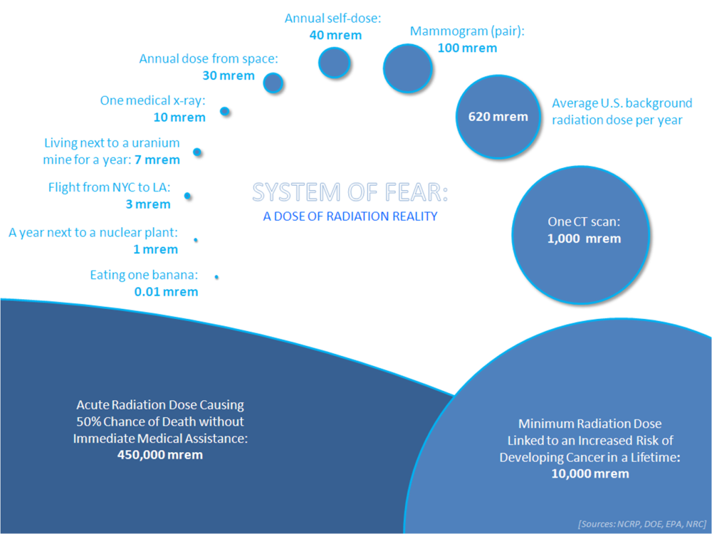
In line with last week’s post, please see the below infographic, which paints radiation doses in the visual context of a sort of system of planets according to size (click to enlarge):
As is plainly evident, it’s shocking how much the public perception of radiation doses and negative health effects differs from reality.
(For example, in today’s perceptual climate, who would believe that a person could live within a mile of a nuclear powerplant for a thousand years before receiving the radiation dose from a single medical CT scan?)
If feedback to this is positive, I think I’ll make this the first in a series of similar infographics. (Perhaps people would find it interesting/useful to next have illustrated the relative magnitudes of nuclear disasters?)
_______________________________________________
If anyone doubts the numbers in the above diagram, please feel free to investigate the references for yourselves!
International Atomic Energy Agency:
http://www.iaea.org/Publications/Factsheets/English/radlife.html
U.S. Environmental Protection Agency:
http://www.epa.gov/radiation/understand/perspective.html
U.S. Nuclear Regulatory Commission:
http://www.nrc.gov/about-nrc/radiation/around-us/doses-daily-lives.html
U.S. National Council on Radiological Protection (via the Health Physics Society):
Click to access environmental_radiation_fact_sheet.pdf
U.S. Department of Energy:
http://lowdose.energy.gov/faqs.aspx#05


Reblogged this on robert's space and commented:
pls man i use rads.
Of course, if that nuclear plant does a Chernobyl/Fukishima, then all bets are off. I think the risk of accident, the long history of nuclear warfare threat, drives much fear. Not that you are incorrect, but worries have to be put in that context.
dsfp